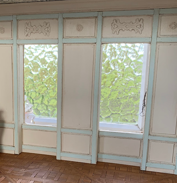
This room is in the original building that I added the rooftop bedroom onto.
It will now become the middle floor of the building.
This one room has many spaces that need to fit in it - kitchen, dining area, lounge, the staircase to the bedroom and an entryway and door to outside.
Here's how the room looked when I began stripping it back.
As the room is tight on space I removed the window on the left side wall and boarded it up.
I used foamboard to create some depth to the wall around the windows.
The wall design just sort of happened!
Everything looks better with a little aging.
There's not much room for the staircase so it had to be really steep.
It was too difficult to build a handrail for such a steep staircase so I added a wall to enclose it.
All the walls in this room can be removed.
It's nothing short of a miracle that they actually fit. All too often my measurements are wrong!
And now I have the added challenge of finding something to fit in the space under the stairs!
The empty space on the right there will be the entry door from outside. It's on the side of the building.
So this is a sort of entrance hall.
Still working on the door.
The space on the left behind this wall is where the worlds tiniest kitchen will go!
The kitchen space - 7.5 centimetres deep by 17 centimetres wide!
(3 inches deep by 6 and a half inches wide)
Of course now I can't decide what's going to go in there...the older I get the harder it seems to be to make decisions.
So here's where it's up to.
Too many decisions to make about what to work on next, aaarrrggghhhh!!!
But I'm happy with how it looks so far.
The floor below will the the Patisserie - not even thinking about that yet!


I love this look. Makes me want to build a quaint French house. Alas, no more room but I love and covet this house. Eye candy.
ReplyDeleteIt looks so pretty! I like your idea of enclosing the staircase. You could put a little secretary's desk in the niche under it maybe? Or make a reading nook?
ReplyDeleteYa puedes estar contenta. Está muy bonita.
ReplyDeleteSoft colours and walls trimmed with moldings make the spaces beautifully serene and very pretty. Looking forward to all the decisions you will make about what to put where! Cheers, Alayne
ReplyDeleteI am enjoying following along with this build. What wonderful panelling you have created .... and yes, I agree, a miracle that the walls fit and can be taken in and out. That is a big challenge for me as well!
ReplyDeleteTake care.
Janine
Sometimes the tiniest of spaces have the greatest impact, especially when in the hands of the likes of you and Elizabeth (Studio E). This space you are creating is definitely inspired and is already packed with a mansion full of charm! Wonderful to follow!
ReplyDeleteVery fine room and colors. I looking forward to see more!
ReplyDeleteBritt
It’s looking gorgeous, and fun with all those little spaces marked out!
ReplyDeleteI love how you are bringing this charming little house together. Your decision to close up the extra window then add a thicker wall was spot on. The colours being used are already building up that "old world" feeling. I just know the end product is going to be exquisite. - Marilyn D.
ReplyDeleteQue espacio tan encantador estás creando! Me encantan los tonos y la división de los espacios se ve genial!!
ReplyDeleteBesos.
Amor a primera vista, me encanta como has logrado la distribución y las escaleras el efecto es genial; queda un recibidor fantástico. Los colores muy cálidos así que estoy deseosa de ver lo siguiente.
ReplyDeleteI love the soft colors and the beautiful panelling you have created, Mercedes!great work!!!
ReplyDeleteAmazing work, I too love the colours and also the wall design. It's incredible what you managed to put in just one room.
ReplyDeleteGeneviève
It's beautiful, the colours, the panelling and the ageing are gorgeous, and you've done a wonderful job with the stairs. I empathise with your measuring skills and "the older you get the harder it seems to be to make decisions"!! That is me.
ReplyDeleteStunning, stunning, stunning! Most innovative use of space. This is going to be a museum-worthy house.
ReplyDeleteIt's looking fabulous, so much character in such a small space, love the blue. It's going to be a wonderful room.
ReplyDeleteYou have a special for creating small spaces with so much character I love what you have done!
ReplyDelete